

Upgrade Guide#
Welcome to the Upgrade Guide for Panel! When we make backward-incompatible changes, we will provide a detailed guide on how you can update your application to be compatible with the latest changes.
Version 1.10#
Panel 1.10.0 requires Bokeh 3.10 and serves its applications on its own ASGI application in addition to the existing Tornado server. This means the FastAPI and Django integrations are now implemented in Panel itself, so the bokeh-fastapi and bokeh-django packages are no longer used and are no longer installed by panel[fastapi] or the new panel[django] extra. If your environment pins either of them you can remove them.
Moving to panel.ui#
panel.ui is an opt-in component namespace built from Material UI components and classic Panel components without a Material equivalent. Existing pn.widgets, pn.layout, pn.pane, and other classic imports continue to work; importing panel alone does not switch them to Material components. Use pn.ui or import from a submodule such as panel.ui.widgets when adopting the new components. Flat and submodule imports refer to the same class.
import pandas as pd
import panel as pn

pn.ui.Button(label='Run')           # Material UI button
pn.ui.widgets.Button(label='Run')   # same class
pn.ui.Tabulator(value=pd.DataFrame({'value': [1, 2]}))  # classic component, re-exported unchanged
Material components can be mixed with classic components in an app. Panel 1.9 added label as an alias for name on classic components, so you can adopt that spelling before switching namespaces. We have made a best effort to keep classic and Material components compatible, but they are not 1:1 everywhere. Check Classic and panel.ui compatibility for known parameter and default differences, and test callback behavior before replacing a classic widget. Importing panel.ui selects the Material UI design if you have not explicitly configured another design. To keep a chosen design, set it before importing panel.ui.
Migrate Python files#
Install the migration tool’s optional dependency, then preview the changes before rewriting files:
pip install 'panel[migrate]'
panel migrate --check my_app/
panel migrate --diff my_app/
panel migrate my_app/
panel migrate accepts Python files or directories (searched recursively for *.py). --check reports proposed rewrites without editing files and exits with a non-zero status if anything would change. --diff prints a unified diff without editing files. The command reports rewrites and items that need manual review; a successful exit does not mean there are no manual review items.
For example, a classic pn.widgets.Button(name='Run') call becomes pn.ui.Button(label='Run'). If the file does not already import panel as pn, the tool adds that import. Where supported, the tool also renames button_type to color and button_style to variant, converts MenuButton(split=True) to SplitButton, and replaces compatible classic template calls with pn.ui.Page(...). In files it migrates to pn.ui, it removes explicit selections of Panel’s built-in designs so the app uses the Material UI design, and reports custom designs for manual review. Review the diff, especially button callbacks, templates, and any design settings you need to retain. Calls with unsupported parameters, argument unpacking, or template options that cannot be confirmed compatible are left unchanged and reported for manual review. The tool changes Python source, not notebooks.
For RadioButtonGroup and CheckButtonGroup, classic variant='solid' maps to variant='contained' and variant='outline' maps to variant='outlined'. The new component constructors also accept the classic spellings. panel migrate converts literal variant and button_style values for these groups; dynamic expressions need manual review.
Classic and panel.ui compatibility#
The following tables compare the public Param parameters of classic components with their panel.ui counterparts. A component re-exported unchanged from classic Panel has the same Python class and parameter API. For Material replacements, a matching parameter name does not guarantee identical validation or behavior; compare the individual component references and test the result in your app. The differences below reflect the updated panel-material-ui implementation; install a release containing those changes before relying on the restored parameters and defaults.
Classic component |
Parameters absent from |
Migration consideration |
|---|---|---|
|
|
Review date entry and picker mode. |
|
|
Check output types as well as input behavior. |
|
|
Material editable sliders do not offer this switch. |
|
|
Review loading timing. |
|
|
Use |
|
|
Review color selection; |
|
|
Review overflow behavior. |
|
|
Review header styling and auto-scrolling. |
Component |
Classic default or parameter type |
|
|---|---|---|
|
|
|
|
|
|
|
|
|
|
|
|
|
Boolean |
Number |
|
Integer |
Selector |
|
Integer |
Boolean |
|
|
|
|
|
|
The flat namespace also has name collisions: pn.ui.DataFrame is the classic pane, not pn.widgets.DataFrame (use pn.ui.Tabulator for an editable table), and pn.ui.Alert is the Material layout, not pn.pane.Alert. Review these calls manually: panel migrate may rewrite them if their arguments do not reveal the mismatch. Classic templates are not same-named panel.ui classes; use pn.ui.Page and review template-specific options manually. The command flags unsupported arguments it can identify, but it cannot detect changes to defaults or runtime behavior.
FastAPI#
The public API of panel.io.fastapi is unchanged, i.e. add_application, add_applications, get_server and serve behave as they did before, and you no longer have to install bokeh-fastapi alongside Panel. The applications are now dispatched by a middleware rather than a mount, which means it no longer matters whether you call add_applications before or after registering your own routes. See the FastAPI how-to guide for details.
Django#
The Django integration no longer relies on channels, daphne or bokeh-django. Instead Panel composes its own ASGI application with the one Django provides and hands every request it does not own to Django. Existing projects keep the document, autoload, directory, with_request and with_url_args helpers, but import them from panel.io.django and declare the applications in the project’s asgi.py:
import django

django.setup()

import myapp.pn_app as pn_app

from panel.io.django import autoload, get_asgi_application

application = get_asgi_application([
    autoload('myapp', pn_app.app),
])
The routing.py module, the bokeh_apps urlpatterns and STATICFILES_DIRS = [bokehjsdir()] are no longer needed. The project is served by an ASGI server such as uvicorn rather than a WSGI one; in development, add panel.io.django to the top of the INSTALLED_APPS and manage.py runserver will serve the ASGI application with uvicorn, the same way channels and daphne used to take that command over. RoutingConfiguration, DjangoBokehConfig and the Channels consumers raise an error pointing at the new API. The Django how-to guide has a full migration section.
Choosing a server from the command line#
panel serve gained a --server option to pick the implementation:
panel serve app.py --server fastapi
The choices are tornado (the default, unchanged), fastapi and asgi, the latter running Panel’s ASGI application under uvicorn without importing FastAPI. The ASGI implementations support everything the Tornado server does apart from --rest-provider, --rest-session-info, --enable-xsrf-cookies and --num-procs, each of which fails with an error naming the option. Authentication, including all the OAuth providers, works on either implementation and the cookies are interoperable, so you can move between them without invalidating existing sessions.
--plugins is supported on --server fastapi, but since the endpoints are no longer Tornado request handlers the plugin module has to declare a FastAPI APIRouter in a ROUTER variable rather than a list of ROUTES. A module may declare both and then be served on either implementation. See Add custom endpoints for the details.
Version 1.0#
The 1.0 release brings a wealth of improvements compared to the 0.x series, including significant changes to the layout engine and an improved approach to handling CSS for individual components. These improvements are thanks to the new Bokeh 3.x releases, which received a bottom-up rewrite of layouts and CSS handling. These updates not only boost the performance but also elevate the customizability of your Panel apps.
As with any major update, it’s important to understand the implications of these changes for your existing applications. This guide is designed to walk you through the key updates introduced in Panel 1.0, the rationale behind them, and the critical considerations to consider while adapting your applications to this new version. We’ll take you on a comprehensive journey, outlining how the new layout engine transforms how you create and manage your Panel apps and the impact of the enhanced CSS handling on your components.
By the end of this guide, you will have a clear understanding of how to leverage the full potential of Panel 1.0’s features and enhancements, ensuring a smooth transition for your applications. So, without further ado, let’s dive into the exciting world of Panel 1.0 and explore the new possibilities it has to offer!
The layout engine#
Panel 1.0, built upon Bokeh 3.0, introduces a CSS-based layout engine that replaces the previous engine, primarily optimized for plotting. This upgrade results in improved performance, especially when handling a multitude of components on the page at the same time and makes it possible to create more complex applications without sacrificing speed and responsiveness.
Additionally, Panel 1.0 offers better sizing of components that are slow to render, such as images. By removing the need for explicit CSS size overrides, Panel 1.0 streamlines the customization process for your layouts. This added flexibility makes it easier to tailor your apps to fit your design goals and user needs.
However, it’s important to note that the complete replacement of the layout implementation might not ensure identical behavior to previous versions. In the upcoming sections, we’ll review key points to consider when adapting to this new layout engine.
sizing_mode#
The sizing_mode has been the primary way to configure the responsiveness of components in Panel, and that has not changed. However, previously the layout engine was quite forgiving in the way it interpreted combinations of the sizing_mode and explicit width/height settings that really did not make sense. Before we dive into some of these differences, let’s briefly go through the different sizing_mode options and what they actually mean:

stretch_width: Stretches content/container in width, while the size of contents determines the height.stretch_height: Stretches content/container in height, while the size of contents determines the width.stretch_both: Stretches content/container in both width and height.
Now let us explore what changed in this release. In the past, the behavior of a responsive component inside a non-responsive container was poorly defined. Generally it would force the container to be responsive as well, but often it would only be width responsive. In this release there are a number of well defined behaviors which determine how a container behaves when it wraps one or more responsively sized component:
If a child is responsive in width then the layout should also be responsive in width (unless a fixed
widthhas been).If a container is vertical (e.g. a
Column) or supports responsive reflowing (e.g. aFlexBox) and a child is responsive in height then the container should also be height-responsive (unless a fixedheightis set).If a container is horizontal (e.g. a
Row) and all children are responsive in height then the container should also be height-responsive. This behavior is asymmetrical with width because there isn’t always vertical space to expand into and it is better for the component to match the height of the other children.If any children declare a fixed
widthorheightthen the container will inherit these asmin_widthandmin_heightsettings to ensure that sufficient space is allocated.
These very explicit rules ensure consistent behavior in most cases, however it is always best to be explicit and declare the sizes.
Let us walk through an example. Below we declare a responsive Image and a fixed-size Markdown pane inside a Row. According to the rules above the Row layout will inherit responsive sizing in width but not height. Additionally it will inherit a min_width from the Markdown pane.
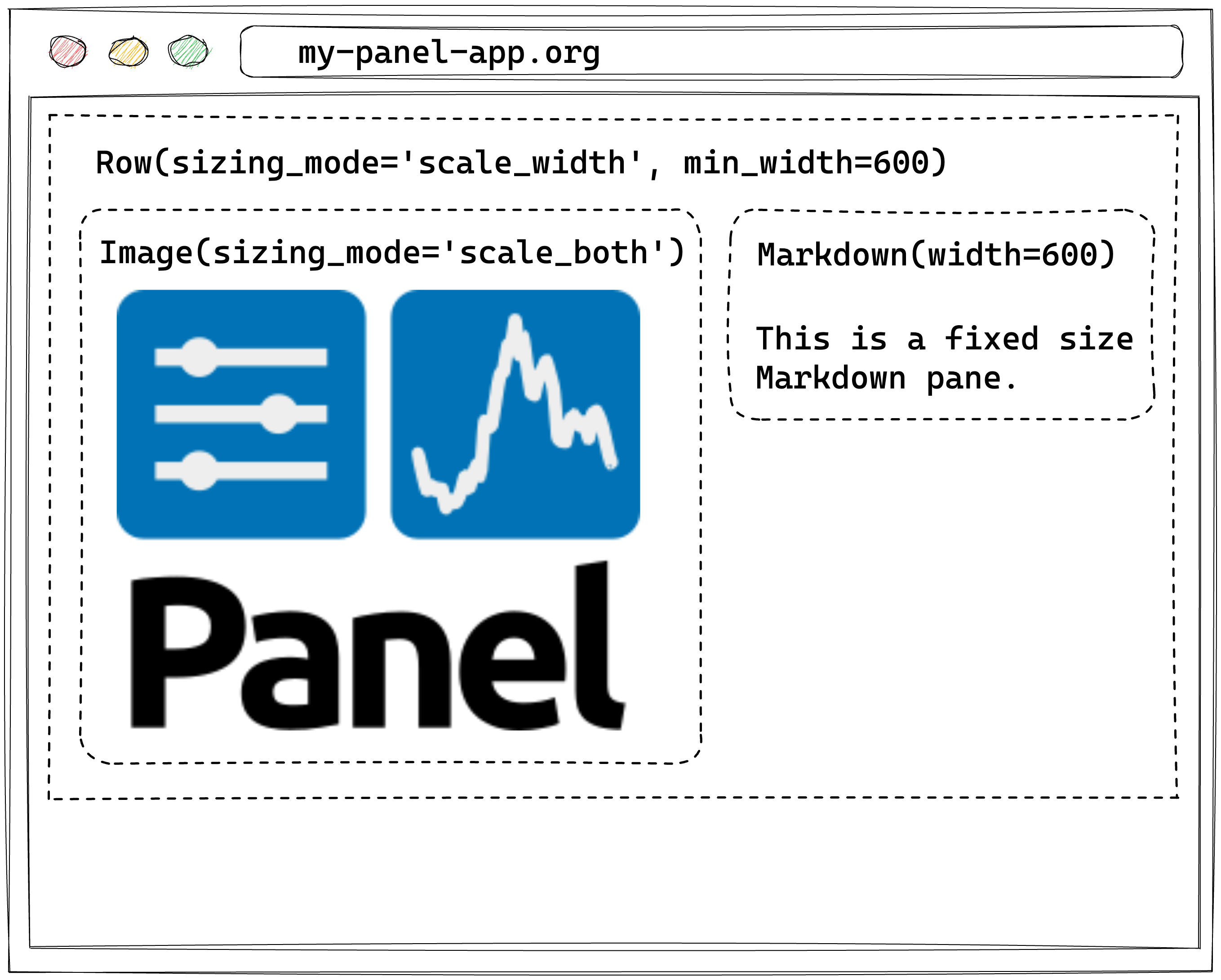
Note
To maintain backward compatibility Panel will still try to infer the appropriate sizing mode by inspecting the children of a container. It is, however, always best to be explicit.
Current behavior
The rules above describe the behavior as of Panel 1.0 and have since been
refined, e.g. FlexBox now derives its sizing_mode from its flex_direction
rather than from its children. Panel also now warns when child inference
overrides a sizing_mode you set on a layout yourself, and offers the
respect_explicit_sizing config option to disable inference for explicitly
sized layouts. See Sizing Mode Inference on Layouts for the current rules and how
to opt out.
Ambiguous configurations#
In the past, Panel would happily accept ambiguous layout configurations, e.g., providing a fixed width while also setting a responsive sizing_mode along the same dimension. As an example, take the following:
pn.pane.Image(..., sizing_mode='stretch_both', width=500)
This specification is ambiguous. Did you want it to stretch the width, or did you want to set a fixed width? In the past, this would be resolved in favor of making the component responsive, i.e. ignoring the width value. In Panel 1.0, we will warn that this is not a supported configuration and turn the width into a min_width. In the future, this conflicting specification will error. To toggle these errors on instead of a warning, set layout_compatibility to 'error':
pn.extension(layout_compatibility='error')
# OR
pn.config.layout_compatibility = 'error'
CSS styling#
The other major change in Panel 1.0 is in the CSS handling on components. Starting in Bokeh 3.0 each component is now rendered into the Shadow DOM. While you don’t have to understand the intricacies of how the shadow DOM works, know that each component is now encapsulated and therefore isolated from the rest of the page. This has big benefits because each component can be styled fully independently without the CSS leaking to other components but it also has significant backward compatibility implications.
Global vs. local stylesheets#
In the past, it was possible to declare global stylesheets that could override the styles of all components on the page. As a backward compatibility measure, any stylesheets defined using the raw_css and css_files config parameters, e.g., by setting:
pn.extension(raw_css=['div.widget-box { color: red; }'], css_files=['https://panel.holoviz.org/custom.css'])
is now strongly discouraged. Because global stylesheets no longer affect the encapsulated components, we will inject these stylesheets directly into each component, which is highly inefficient.
Attention
Usage of pn.config.raw_css and pn.config.css_files is now strongly discouraged.
Depending on whether your custom CSS controlled the styling of individual components or the template, you should now either use the stylesheets property on each component OR use the raw_css and css_files parameters on the template.
Component Stylesheets#
Now that each component is isolated from the rest of the page, it is possible to style each component separately by injecting stylesheets. This is what makes it possible for each component to be styled using the design frameworks (see the how-to guide on applying designs). Instead of injecting global stylesheets, you should now apply the stylesheets on the component.
Let us walk through a simple example. Let’s say you had a global stylesheet that would change the style of a Slider handle. Previously you would have injected this globally like this:
import panel as pn

slider_css = """
.noUi-handle {
  border-radius: 100%;
  box-shadow: unset;
  background-color: #0081f3;
}
"""

pn.extension(raw_css=[slider_css])
Now you can inject it directly on the specific component you want to override like this:
import panel as pn

slider_css = """
.noUi-handle {
  border-radius: 100%;
  box-shadow: unset;
  background-color: #0081f3;
}
"""

pn.widgets.FloatSlider(label='Number', stylesheets=[slider_css])
Alternatively you can also modify the class default like this:
pn.widgets.FloatSlider.stylesheets = [slider_css]
For more details on applying CSS to components see the corresponding how-to guide.
Template Stylesheets#
Sometimes there is still a need to change the appearance of the overall template. Instead of injecting those options via the global raw_css and css_files config parameters you can inject them directly on a template, e.g.:
pn.template.MaterialTemplate(
    raw_css=[...], css_files=[...]
)
or if you are using a global template:
pn.state.template.param.update(
    raw_css=[...], css_files=[...]
)
Loading extensions#
In the past Panel extensions could be loaded using the pn.extension call, or, if no extension call was present, could simply be imported. When serving an application Panel would then include the resources for all loaded extensions. This meant that when serving multiple applications that required very different components you may end up loading resources for components were not even used.
Going forward we strongly recommend that you always declare which components a particular application is using with a pn.extension call, e.g. if you are using the Tabulator widget and the Vega pane you should declare:
import panel as pn

pn.extension('tabulator', 'vega', ...)
at the top of your application. The flipside of this is that if you call pn.extension but fail to declare the actual requirements then those resources will not be loaded and your application will not render correctly.
Tip
We recommend always declaring all required extensions at the top of your application.
Smaller changes#
Tabulator.frozen_rowsnow respects the order of rows in the data instead of the order in which thefrozen_rowswere defined.Viewable.embednow returns aMimebundleobject that can be rendered in a notebook but also in other contexts.The
policyargument toonpn.cacheused to accept'LIFO'but instead implemented a'FIFO'policy. This has been fixed and the function now only accepts'LRU','LIFO', and'LFU'policies.
Deprecations#
The following changes have been deprecated; we will warn you and guide you on how to update them.
styles and background#
To align with the definition set by Bokeh 3.x, style has been renamed to styles, and the background is now needed to be set inside the styles dictionary:
# Before:
pn.pane.Markdown("# Hello", background="red")
# Now:
pn.pane.Markdown("# Hello", styles={'background': 'red'})
Ace renamed to CodeEditor#
pn.widgets.Ace() has been renamed to pn.widgets.CodeEditor() to reflect better what the component does and not the implementation used.
