Penguin Crossfilter#
Cross-filtering Palmer Penguins#
import numpy as np
import pandas as pd
import panel as pn

import holoviews as hv
import hvplot.pandas # noqa

hv.extension('bokeh')
In this introduction to building interactive dashboards we will primarily be using 4 libraries:
Pandas: To load and manipulate the data
hvPlot: To quickly generate plots using a simple and familiar API
HoloViews: To link selections between plots easily
Panel: To build a dashboard we can deploy
Building some plots#
Let us first load the Palmer penguin dataset (Gorman et al.) which contains measurements about a number of penguin species:
penguins = pd.read_csv('data/penguins.csv')
penguins.head()
| studyName | Sample Number | Species | Region | Island | Stage | Individual ID | Clutch Completion | Date Egg | Culmen Length (mm) | Culmen Depth (mm) | Flipper Length (mm) | Body Mass (g) | Sex | Delta 15 N (o/oo) | Delta 13 C (o/oo) | Comments | |
|---|---|---|---|---|---|---|---|---|---|---|---|---|---|---|---|---|---|
| 0 | PAL0708 | 1 | Adelie Penguin | Anvers | Torgersen | Adult, 1 Egg Stage | N1A1 | Yes | 11/11/07 | 39.1 | 18.7 | 181.0 | 3750.0 | MALE | NaN | NaN | Not enough blood for isotopes. |
| 1 | PAL0708 | 2 | Adelie Penguin | Anvers | Torgersen | Adult, 1 Egg Stage | N1A2 | Yes | 11/11/07 | 39.5 | 17.4 | 186.0 | 3800.0 | FEMALE | 8.94956 | -24.69454 | NaN |
| 2 | PAL0708 | 3 | Adelie Penguin | Anvers | Torgersen | Adult, 1 Egg Stage | N2A1 | Yes | 11/16/07 | 40.3 | 18.0 | 195.0 | 3250.0 | FEMALE | 8.36821 | -25.33302 | NaN |
| 3 | PAL0708 | 5 | Adelie Penguin | Anvers | Torgersen | Adult, 1 Egg Stage | N3A1 | Yes | 11/16/07 | 36.7 | 19.3 | 193.0 | 3450.0 | FEMALE | 8.76651 | -25.32426 | NaN |
| 4 | PAL0708 | 6 | Adelie Penguin | Anvers | Torgersen | Adult, 1 Egg Stage | N3A2 | Yes | 11/16/07 | 39.3 | 20.6 | 190.0 | 3650.0 | MALE | 8.66496 | -25.29805 | NaN |
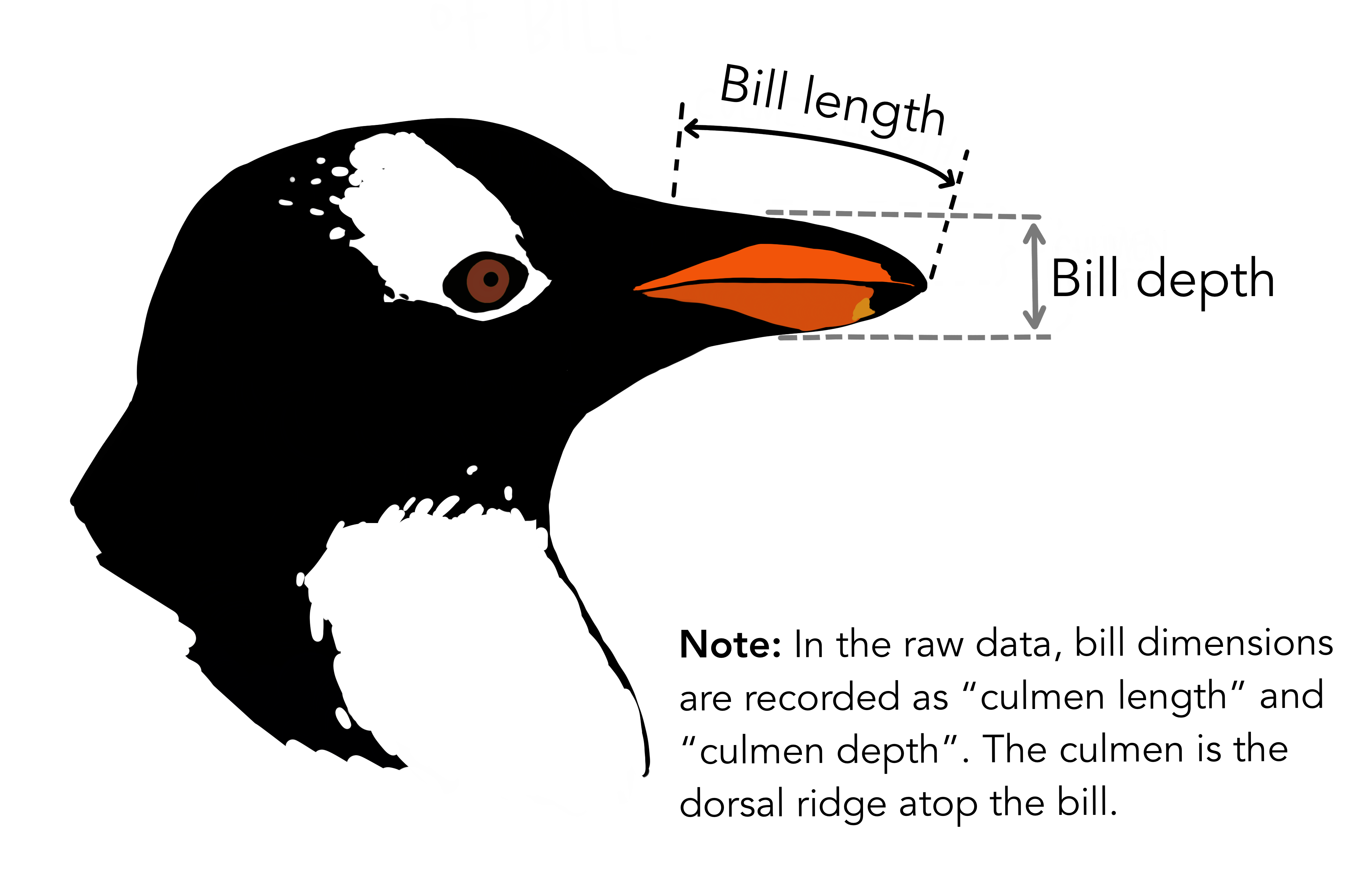
This diagram provides some background about what these measurements mean:
Next we define an explicit colormapping for each species:
colors = {
    'Adelie Penguin': '#1f77b4',
    'Gentoo penguin': '#ff7f0e',
    'Chinstrap penguin': '#2ca02c'
}
Now we can start plotting the data with hvPlot, which provides a familiar API to pandas .plot users but generates interactive plots.
We start with a simple scatter plot of the culmen (think bill) length and depth for each species:
scatter = penguins.hvplot.points(
    'Culmen Length (mm)', 'Culmen Depth (mm)', c='Species',
    cmap=colors, responsive=True, min_height=300
)

scatter
Next we generate a histogram of the body mass colored by species:
histogram = penguins.hvplot.hist(
    'Body Mass (g)', by='Species', color=hv.dim('Species').categorize(colors),
    legend=False, alpha=0.5, responsive=True, min_height=300
)
histogram
Next we count the number of individuals of each species and generate a bar plot:
bars = penguins.hvplot.bar(
    'Species', 'Sample Number', c='Species', cmap=colors,
    responsive=True, min_height=300
).aggregate(function=np.count_nonzero)

bars
Finally we generate violin plots of the flipper length of each species split by the sex:
violin = penguins.hvplot.violin(
    'Flipper Length (mm)', by=['Species', 'Sex'], cmap='Category20',
    responsive=True, min_height=300, legend='bottom_right'
).opts(split='Sex')

violin
Linking the plots#
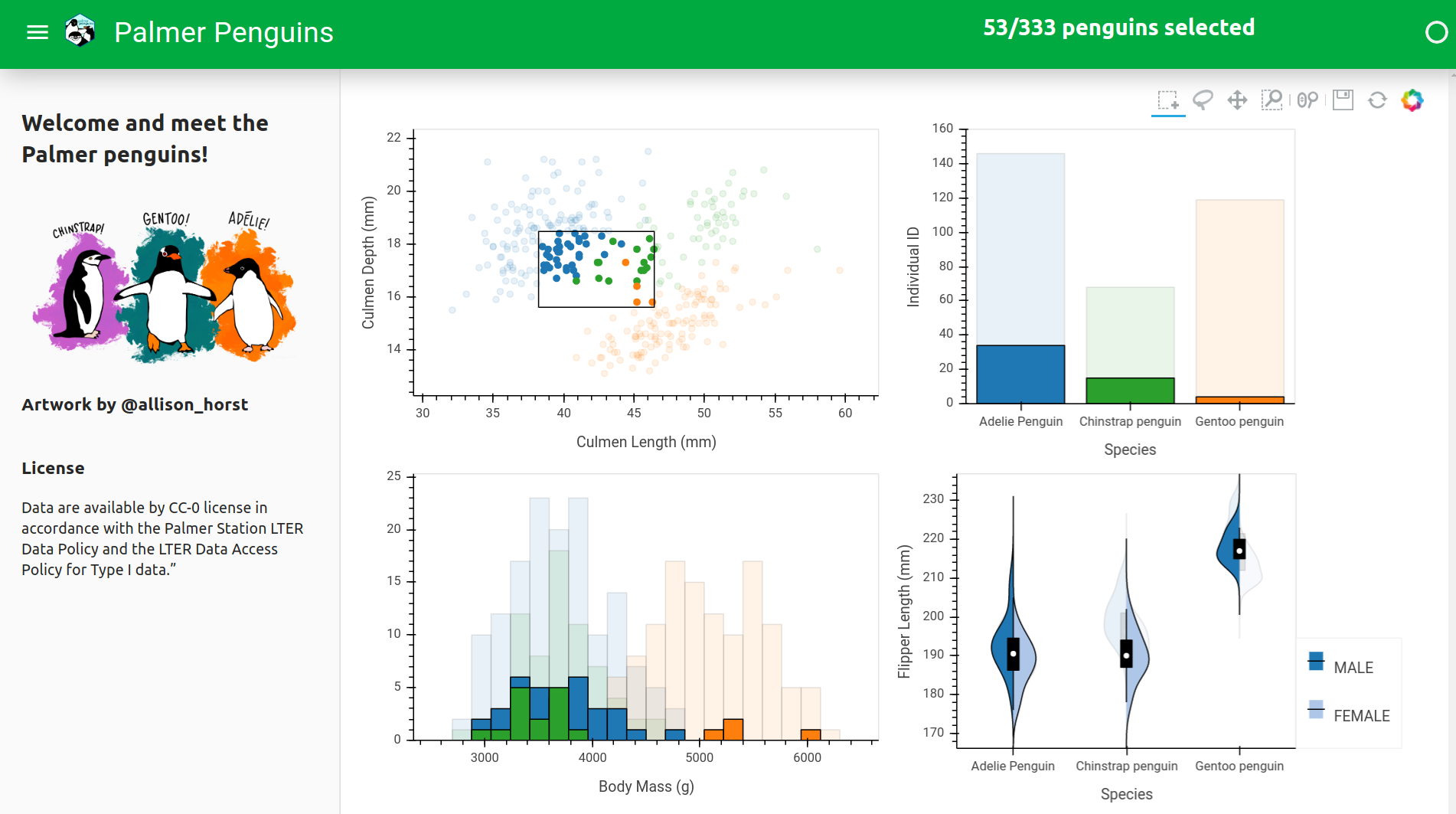
hvPlot let us build interactive plots very quickly but what if we want to gain deeper insights about this data by selecting along one dimension and seeing that selection appear on other plots? Using HoloViews we can easily compose and link these plots:
ls = hv.link_selections.instance()

ls(scatter.opts(show_legend=False) + bars + histogram + violin).cols(2)
Building a dashboard#
As a final step we will compose these plots into a dashboard using Panel, so as a first step we will load the Palmer penguins logo:
logo = pn.panel('data/logo.png', height=60)
logo
Next we define use some functionality on the link_selections object to display the count of currently selected penguins:
def count(selected):
    return f"## {len(selected)}/{len(penguins)} penguins selected"


selected = pn.pane.Markdown(
    pn.bind(count, ls.selection_param(penguins)),
    align='center', width=400, margin=(0, 100, 0, 0)
)

selected
Now we will compose these two items into a Row which will serve as the header of our dashboard:
welcome = "## Welcome and meet the Palmer penguins!"

penguins_art = pn.pane.PNG('./data/lter_penguins.png', height=160)

credit = "### Artwork by @allison_horst"

instructions = """
Use the box-select and lasso-select tools to select a subset of penguins
and reveal more information about the selected subgroup through the power
of cross-filtering.
"""

license = """
### License

Data are available by CC-0 license in accordance with the Palmer Station LTER Data Policy and the LTER Data Access Policy for Type I data."
"""
art = pn.Column(
    welcome, penguins_art, credit, instructions, license,
    sizing_mode='stretch_width'
)

art
Deploying the dashboard#
material = pn.template.FastListTemplate(logo='./data/logo.png', title='Palmer Penguins')

ls = hv.link_selections.instance()

header = pn.Row(
    pn.layout.HSpacer(), selected,
    sizing_mode='stretch_width'
)

selections = ls(scatter.opts(show_legend=False) + bars.opts(show_legend=False) + histogram + violin).opts(sizing_mode='stretch_both').cols(2)

material.header.append(header)
material.sidebar.append(art)
material.main.append(selections)

material.servable();

