
Gapminders#

In his Gapminder example during a 2006 TED Talk, Hans Rosling debunked stereotypes about developed and undeveloped countries using statistics and data visualization, revealing the nuanced reality of global development. We will be recreating this example using four different plotting libraries (Matplotlib, Plotly, Vega-Altair, hvPlot, which will be controlled by widgets from Panel.
Imports and Configuration#
import numpy as np
import pandas as pd
import panel as pn

import altair as alt
import plotly.graph_objs as go
import plotly.io as pio
import matplotlib.pyplot as plt
import matplotlib as mpl
import hvplot.pandas  # noqa
import warnings

warnings.simplefilter('ignore')
pn.extension('vega', 'plotly', defer_load=True, sizing_mode="stretch_width")
mpl.use('agg')
Let’s also define some constant variables for our plots.
XLABEL = 'GDP per capita (2000 dollars)'
YLABEL = 'Life expectancy (years)'
YLIM = (20, 90)
HEIGHT=500 # pixels
WIDTH=500 # pixels
ACCENT="#D397F8"
PERIOD = 1000 # miliseconds
Load Dataset#
We’ll load the Gapminder dataset into a Pandas DataFrame. This dataset contains information about GDP per capita, life expectancy, population, and continent for various countries over several years.
dataset = pd.read_csv('./data/gapminders.csv')
dataset.sample(10)
| country | year | pop | continent | lifeExp | gdpPercap | |
|---|---|---|---|---|---|---|
| 43 | Angola | 1987 | 7874230.0 | Africa | 39.906 | 2430.208311 |
| 956 | Mali | 1992 | 8416215.0 | Africa | 48.388 | 739.014375 |
| 628 | Guinea-Bissau | 1972 | 625361.0 | Africa | 36.486 | 820.224588 |
| 452 | Ecuador | 1992 | 10748394.0 | Americas | 69.613 | 7103.702595 |
| 222 | Cambodia | 1982 | 7272485.0 | Asia | 50.957 | 624.475478 |
| 1271 | Reunion | 2007 | 798094.0 | Africa | 76.442 | 7670.122558 |
| 733 | Iraq | 1957 | 6248643.0 | Asia | 48.437 | 6229.333562 |
| 1388 | Slovenia | 1992 | 1999210.0 | Europe | 73.640 | 14214.716810 |
| 718 | Indonesia | 2002 | 211060000.0 | Asia | 68.588 | 2873.912870 |
| 397 | Czech Republic | 1957 | 9513758.0 | Europe | 69.030 | 8256.343918 |
We’ll also create a constant variable YEARS containing all the unique years in our dataset.
YEARS = [int(year) for year in dataset.year.unique()]
YEARS
[1952, 1957, 1962, 1967, 1972, 1977, 1982, 1987, 1992, 1997, 2002, 2007]
Define Helper Functions#
To keep our code clean and reusable, we define some helper functions. These functions will handle data extraction, title generation, and axis limits calculation.
def get_data(year):
    df = dataset[(dataset.year==year) & (dataset.gdpPercap < 10000)].copy()
    df['size'] = np.sqrt(df['pop']*2.666051223553066e-05)
    df['size_hvplot'] = df['size']*6
    return df

def get_title(library, year):
    return f"{library}: Life expectancy vs. GDP, {year}"

def get_xlim(data):
    return (dataset['gdpPercap'].min()-100, dataset[dataset['gdpPercap'] < 10000].max()['gdpPercap']+1000)
Define Plotting Functions#
We will define separate functions for each plotting library. Each function will create a plot for a given year.
Matplotlib#
def mpl_view(year=1952, show_legend=True):
    data = get_data(year)
    title = get_title("Matplotlib", year)
    xlim = get_xlim(data)

    plot = plt.figure(figsize=(10, 8), facecolor=(0, 0, 0, 0))
    ax = plot.add_subplot(111)
    ax.set_xscale("log")
    ax.set_title(title)
    ax.set_xlabel(XLABEL)
    ax.set_ylabel(YLABEL)
    ax.set_ylim(YLIM)
    ax.set_xlim(xlim)

    for continent, df in data.groupby('continent'):
        ax.scatter(df.gdpPercap, y=df.lifeExp, s=df['size']*5,
                   edgecolor='black', label=continent)

    if show_legend:
        ax.legend(loc=4)

    plt.close(plot)
    return plot

mpl_view(1952, True)
<Figure size 1000x800 with 1 Axes>
Plotly#
pio.templates.default = None

def plotly_view(year=1952, show_legend=True):
    data = get_data(year)
    title = get_title("Plotly", year)
    xlim = get_xlim(data)
    ylim = YLIM
    traces = []
    for continent, df in data.groupby('continent'):
        marker=dict(symbol='circle', sizemode='area', sizeref=0.1, size=df['size'], line=dict(width=2))
        traces.append(go.Scatter(x=df.gdpPercap, y=df.lifeExp, mode='markers', marker=marker, name=continent, text=df.country))

    axis_opts = dict(gridcolor='rgb(255, 255, 255)', zerolinewidth=1, ticklen=5, gridwidth=2)
    layout = go.Layout(
        title=title, showlegend=show_legend,
        xaxis=dict(title=XLABEL, type='linear', range=xlim, **axis_opts),
        yaxis=dict(title=YLABEL, range=ylim, **axis_opts),
        autosize=True, paper_bgcolor='rgba(0,0,0,0)',
    )
    return go.Figure(data=traces, layout=layout)

plotly_view()
Altair#
def altair_view(year=1952, show_legend=True, height="container", width="container"):
    data = get_data(year)
    title = get_title("Altair/ Vega", year)
    xlim = get_xlim(data)
    legend= ({} if show_legend else {'legend': None})
    return (
        alt.Chart(data)
            .mark_circle().encode(
                alt.X('gdpPercap:Q', scale=alt.Scale(type='log', domain=xlim), axis=alt.Axis(title=XLABEL)),
                alt.Y('lifeExp:Q', scale=alt.Scale(zero=False, domain=YLIM), axis=alt.Axis(title=YLABEL)),
                size=alt.Size('pop:Q', scale=alt.Scale(type="log"), legend=None),
                color=alt.Color('continent', scale=alt.Scale(scheme="category10"), **legend),
                tooltip=['continent','country'])
            .configure_axis(grid=False)
            .properties(title=title, height=height, width=width, background='rgba(0,0,0,0)')
            .configure_view(fill="white")
            .interactive()
    )

altair_view(height=HEIGHT-100, width=1000)
hvPlot#
def hvplot_view(year=1952, show_legend=True):
    data = get_data(year)
    title = get_title("hvPlot/ Bokeh", year)
    xlim = get_xlim(data)

    return data.hvplot.scatter(
        'gdpPercap', 'lifeExp', by='continent', s='size_hvplot', alpha=0.8,
        logx=True, title=title, legend='bottom_right',
        hover_cols=['country'], ylim=YLIM, xlim=xlim, ylabel=YLABEL, xlabel=XLABEL, height=400

    )

hvplot_view()
Define Widgets#
We will set up a periodic callback to cycle through the years with a slider and checkbox widget for showing the legend. These widgets allow users to interact with our app.
year = pn.widgets.DiscreteSlider(value=YEARS[-1], options=YEARS, name="Year")
show_legend = pn.widgets.Checkbox(value=True, name="Show Legend")
def play():
    if year.value == YEARS[-1]:
        year.value=YEARS[0]
        return

    index = YEARS.index(year.value)
    year.value = YEARS[index+1]

periodic_callback = pn.state.add_periodic_callback(play, start=False, period=PERIOD)
player = pn.widgets.Checkbox.from_param(periodic_callback.param.running, name="Autoplay")
widgets = pn.Column(year, player, show_legend, margin=(0,15))
widgets
Layout Widgets#
Now we can craete a Panel layout containing a logo, description and the widgets through the use of pn.Column.
logo = pn.pane.PNG(
    "https://panel.holoviz.org/_static/logo_stacked.png",
    link_url="https://panel.holoviz.org", embed=False, width=150, align="center"
)

desc = pn.pane.Markdown("""## 🎓 Info

The [Panel](https://panel.holoviz.org) library from [HoloViz](https://holoviz.org) \
lets you make widget-controlled apps and dashboards from a wide variety of \
plotting libraries and data types. Here you can try out four different plotting libraries \
controlled by a couple of widgets, for Hans Rosling's \
[gapminder](https://demo.bokeh.org/gapminder) example.
""")

settings = pn.Column(logo, "## ⚙️ Settings", widgets, desc)
settings
Bind Widgets to Plots#
Next, we create a function that will generate a list of plots encapsulated in pn.pane objects. This function takes parameters for the year and whether to display legends on the plots.
def update_views(year, show_legend):
    mpl_v = mpl_view(year=year, show_legend=show_legend)
    plotly_v = plotly_view(year=year, show_legend=show_legend)
    altair_v = altair_view(year=year, show_legend=show_legend)
    hvplot_v = hvplot_view(year=year, show_legend=show_legend)

    return [
        pn.pane.Vega(altair_v, sizing_mode='stretch_both', margin=10),
        pn.pane.HoloViews(hvplot_v, sizing_mode='stretch_both', margin=10),
        pn.pane.Matplotlib(mpl_v, format='png', sizing_mode='stretch_both', tight=True, margin=10),
        pn.pane.Plotly(plotly_v, sizing_mode='stretch_both', margin=10)

    ]
Then we will call pn.bind using the function created above. This will update the plots whenever the slider widget is moved.
We layout the plots in a Gridbox with two columns. Panel provides many other layouts that might be perfect for your use case. Here in the notebook, we’ll display our gridbox layout of plot to the right of the widgets.
gridbox = pn.layout.GridBox(
    objects = pn.bind(update_views, year=year, show_legend=show_legend),
    ncols=2,
    sizing_mode="stretch_both"
)

pn.Row(
    pn.Row(settings, width=250),
    gridbox
)
Configure the Template#
Finally, we layout out the app in the styled FastListTemplate.
pn.template.FastListTemplate(
    sidebar=[settings],
    main=[gridbox],
    site="Panel",
    site_url="https://panel.holoviz.org",
    title="Hans Rosling's Gapminder",
    header_background=ACCENT,
    accent_base_color=ACCENT,
    favicon="static/extensions/panel/images/favicon.ico",
    theme_toggle=False,
).servable();  # We add ; to avoid showing the app in the notebook
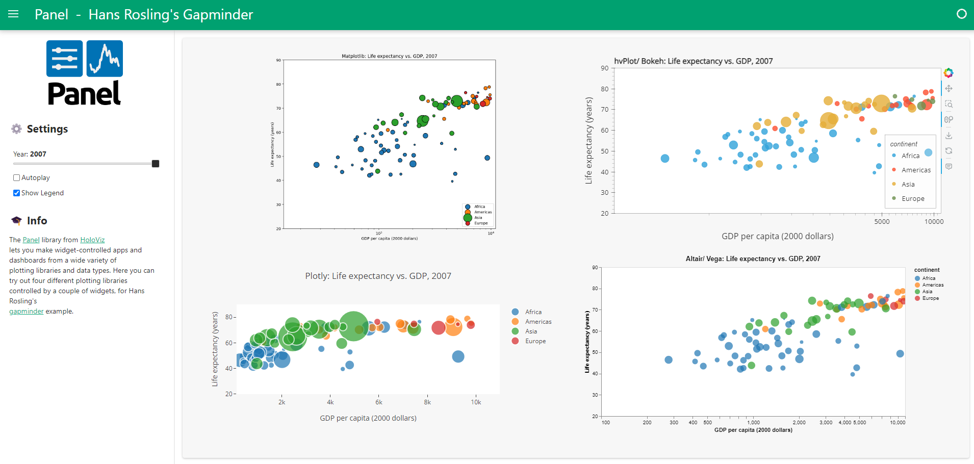
Congrats, you are finished! The final data app can be served via panel serve gapminders.ipynb.
It will look something like.