Multichannel Timeseries Workflow#
Prerequisites#
What? |
Why? |
|---|---|
For context and workflow selection/feature guidance |
Overview#
For an introduction, please visit the ‘Index’ page. This workflow is tailored for processing and analyzing ‘medium-sized’ multi-channel timeseries data derived from electrophysiological recordings.
What Defines a ‘Medium-Sized’ Dataset?#
In this context, we’ll define a medium-sized dataset as that which is challenging for browsers (roughly more than 100,000 samples) but can be handled within the available RAM without exhausting system resources.
Why Downsample?#
Medium-sized datasets can strain the processing capabilities when visualizing or analyzing data directly in the browser. To address this challenge, we will employ a smart-downsampling approach - reducing the dataset size by selectively subsampling the data points. Specifically, we’ll make use of a variant of a downsampling algorithm called Largest Triangle Three Buckets (LTTB). LTTB allows data points not contributing significantly to the visible shape to be dropped, reducing the amount of data to send to the browser but preserving the appearance (and particularly the envelope, i.e. highest and lowest values in a region). This ensures efficient data handling and visualization without significant loss of information.
Downsampling is particularly beneficial when dealing with numerous timeseries sharing a common time index, as it allows for a consolidated slicing operation across all series, significantly reducing the computational load and enhancing responsiveness for interactive visualization. We’ll make use of a Pandas index to represent the time index across all timeseries.
Quick Introduction to MNE#
MNE (MNE-Python) is a powerful open-source Python library designed for handling and analyzing data like EEG and MEG. In this workflow, we’ll utilize an EEG dataset, so we demonstrate how to use MNE for loading, preprocessing, and conversion to a Pandas DataFrame. However, the data visualization section is highly generalizable to dataset types beyond the scope of MNE, so you can meet us there if you have your timeseries data as a Pandas DataFrame with a time index and channel columns.
Imports and Configuration#
from pathlib import Path
import warnings
warnings.filterwarnings('ignore', message='omp_set_nested')

import mne

import panel as pn
import holoviews as hv
from holoviews.operation.downsample import downsample1d

pn.extension('tabulator')
hv.extension('bokeh')
Loading and Inspecting the Data#
Let’s get some data! This section walks through obtaining an EEG dataset (2.6 MB).
DATA_URL = 'https://datasets.holoviz.org/eeg/v1/S001R04.edf'
DATA_DIR = Path('./data')
DATA_FILENAME = Path(DATA_URL).name
DATA_PATH = DATA_DIR / DATA_FILENAME
Note
If you are viewing this notebook as a result of using the `anaconda-project run` command, the data has already been ingested, as configured in the associated yaml file. Running the following cell should find that data and skip any further download.DATA_DIR.mkdir(parents=True, exist_ok=True)
if not DATA_PATH.exists():
import wget
print(f'Data downloading to: {DATA_PATH}')
wget.download(DATA_URL, out=str(DATA_PATH))
else:
print(f'Data exists at: {DATA_PATH}')
Data exists at: data/S001R04.edf
Once we have a local copy of the data, the next crucial step is to load it into an analysis-friendly format and inspect its basic characteristics:
raw = mne.io.read_raw_edf(DATA_PATH, preload=True)
print('num samples in dataset:', len(raw.times) * len(raw.ch_names))
raw.info
Extracting EDF parameters from /home/runner/work/examples/examples/multichannel_timeseries/data/S001R04.edf...
EDF file detected
Setting channel info structure...
Creating raw.info structure...
Reading 0 ... 19999 = 0.000 ... 124.994 secs...
num samples in dataset: 1280000
| General | ||
|---|---|---|
| MNE object type | Info | |
| Measurement date | 2009-08-12 at 16:15:00 UTC | |
| Participant | X | |
| Experimenter | Unknown | |
| Acquisition | ||
| Sampling frequency | 160.00 Hz | |
| Channels | ||
| EEG | ||
| Head & sensor digitization | Not available | |
| Filters | ||
| Highpass | 0.00 Hz | |
| Lowpass | 80.00 Hz | |
This step confirms the successful loading of the data and provides an initial understanding of its structure, such as the number of channels and samples.
Now, let’s preview the channel names, types, unit, and signal ranges. This describe method is from MNE, and we can have it return a Pandas DataFrame, from which we can sample some rows.
raw.describe(data_frame=True).sample(5)
| name | type | unit | min | Q1 | median | Q3 | max | |
|---|---|---|---|---|---|---|---|---|
| ch | ||||||||
| 15 | Cp3. | eeg | V | -0.000208 | -0.000034 | -0.000001 | 0.000033 | 0.000215 |
| 7 | C5.. | eeg | V | -0.000217 | -0.000035 | -0.000001 | 0.000033 | 0.000211 |
| 60 | O1.. | eeg | V | -0.000214 | -0.000036 | -0.000002 | 0.000032 | 0.000249 |
| 37 | F8.. | eeg | V | -0.000175 | -0.000035 | -0.000005 | 0.000027 | 0.000260 |
| 53 | P6.. | eeg | V | -0.000171 | -0.000031 | -0.000002 | 0.000026 | 0.000175 |
Pre-processing the Data#
Noise Reduction via Averaging#
Significant noise reduction is often achieved by employing an average reference, which involves calculating the mean signal across all channels at each time point and subtracting it from the individual channel signals:
raw.set_eeg_reference("average")
EEG channel type selected for re-referencing
Applying average reference.
Applying a custom ('EEG',) reference.
| General | ||
|---|---|---|
| Filename(s) | S001R04.edf | |
| MNE object type | RawEDF | |
| Measurement date | 2009-08-12 at 16:15:00 UTC | |
| Participant | X | |
| Experimenter | Unknown | |
| Acquisition | ||
| Duration | 00:02:05 (HH:MM:SS) | |
| Sampling frequency | 160.00 Hz | |
| Time points | 20,000 | |
| Channels | ||
| EEG | ||
| Head & sensor digitization | Not available | |
| Filters | ||
| Highpass | 0.00 Hz | |
| Lowpass | 80.00 Hz | |
Standardizing Channel Names#
From the output of the describe method, it looks like the channels are from commonly used standardized locations (e.g. ‘Cz’), but contain some unnecessary periods, so let’s clean those up to ensure smoother processing and analysis.
raw.rename_channels(lambda s: s.strip("."));
Optional: Enhancing Channel Metadata#
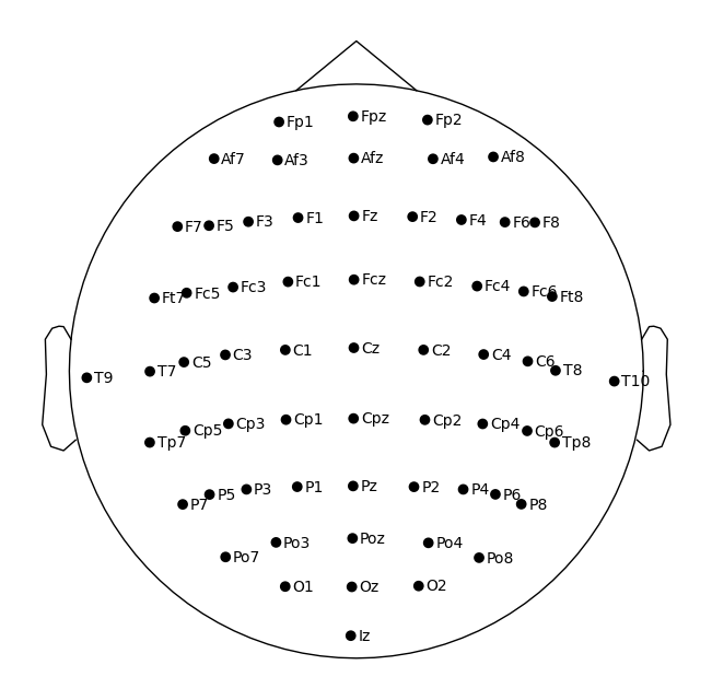
Visualizing physical locations of EEG channels enhances interpretative analysis. MNE has functionality to assign locations of the channels based on their standardized channel names, so we can go ahead and assign a commonly used arrangement (or ‘montage’) of electrodes (‘10-05’) to this data. Read more about making and setting the montage here.
montage = mne.channels.make_standard_montage("standard_1005")
raw.set_montage(montage, match_case=False)
| General | ||
|---|---|---|
| Filename(s) | S001R04.edf | |
| MNE object type | RawEDF | |
| Measurement date | 2009-08-12 at 16:15:00 UTC | |
| Participant | X | |
| Experimenter | Unknown | |
| Acquisition | ||
| Duration | 00:02:05 (HH:MM:SS) | |
| Sampling frequency | 160.00 Hz | |
| Time points | 20,000 | |
| Channels | ||
| EEG | ||
| Head & sensor digitization | 67 points | |
| Filters | ||
| Highpass | 0.00 Hz | |
| Lowpass | 80.00 Hz | |
We can see that the ‘digitized points’ (locations) are now added to the raw data.
Now let’s plot the channels using MNE plot_sensors on a top-down view of a head. Note, we’ll tweak the reference point so that all the points are contained within the depiction of the head.
sphere=(0, 0.015, 0, 0.099) # manually adjust the y origin coordinate and radius
raw.plot_sensors(show_names=True, sphere=sphere, show=False);
Data Visualization#
Preparing Data for Visualization#
We’ll use an MNE method, to_data_frame, to create a Pandas DataFrame. By default, MNE will convert EEG data from Volts to microVolts (µV) during this operation.
TODO: file issue about rangetool not working with datetime (timezone error). When fixed, use
raw.to_data_frame(time_format='datetime')
df = raw.to_data_frame()
df.set_index('time', inplace=True)
df.head()
| Fc5 | Fc3 | Fc1 | Fcz | Fc2 | Fc4 | Fc6 | C5 | C3 | C1 | ... | P8 | Po7 | Po3 | Poz | Po4 | Po8 | O1 | Oz | O2 | Iz | |
|---|---|---|---|---|---|---|---|---|---|---|---|---|---|---|---|---|---|---|---|---|---|
| time | |||||||||||||||||||||
| 0.00000 | 8.703125 | 15.703125 | 50.703125 | 52.703125 | 43.703125 | 39.703125 | -2.296875 | -0.296875 | 17.703125 | 31.703125 | ... | -7.296875 | 5.703125 | -21.296875 | -31.296875 | -52.296875 | -25.296875 | -19.296875 | -34.296875 | -25.296875 | -25.296875 |
| 0.00625 | 46.062500 | 34.062500 | 59.062500 | 56.062500 | 43.062500 | 36.062500 | 3.062500 | 22.062500 | 31.062500 | 33.062500 | ... | 8.062500 | 18.062500 | -9.937500 | -6.937500 | -25.937500 | 6.062500 | 37.062500 | 16.062500 | 27.062500 | 24.062500 |
| 0.01250 | -13.656250 | -14.656250 | 4.343750 | -1.656250 | 0.343750 | 8.343750 | -3.656250 | -24.656250 | -7.656250 | -1.656250 | ... | 46.343750 | 41.343750 | 13.343750 | 28.343750 | 15.343750 | 45.343750 | 43.343750 | 21.343750 | 34.343750 | 36.343750 |
| 0.01875 | -3.015625 | -4.015625 | 12.984375 | -2.015625 | 2.984375 | 7.984375 | -5.015625 | 0.984375 | 9.984375 | 8.984375 | ... | 23.984375 | 2.984375 | -15.015625 | -1.015625 | -5.015625 | 21.984375 | 18.984375 | 0.984375 | 28.984375 | 19.984375 |
| 0.02500 | 20.656250 | 10.656250 | 32.656250 | 12.656250 | 11.656250 | 2.656250 | -17.343750 | 13.656250 | 15.656250 | 12.656250 | ... | 21.656250 | 10.656250 | -4.343750 | 11.656250 | 2.656250 | 28.656250 | 5.656250 | -4.343750 | 31.656250 | 20.656250 |
5 rows × 64 columns
Creating the Main Plot#
As of the time of writing, there’s no easy way to track units with Pandas, so we can use a modular HoloViews approach to create and annotate dimensions with a unit, and then refer to these dimensions when plotting. Read more about annotating data with HoloViews here.
time_dim = hv.Dimension("time", unit="s") # match the df index name
Now we will loop over the columns (channels) in the dataframe, creating a HoloViews Curve element from each. Since each column in the df has a different channel name, which is generally not describing a measurable quantity, we will map from the channel to a common amplitude dimension (see this issue for details of this recent enhancement for ‘wide’ tabular data), and collect each Curve element into a Python list.
In configuring these curves, we apply the .opts method from HoloViews to fine-tune the visualization properties of each curve. The subcoordinate_y setting is pivotal for managing time-aligned, amplitude-diverse plots. When enabled, it arranges each curve along its own segment of the y-axis within a single composite plot. This method not only aids in differentiating the data visually but also in analyzing comparative trends across multiple channels, ensuring that each channel’s data is individually accessible and comparably presentable, thereby enhancing the analytical value of the visualizations. Applying subcoordinate_y has additional effects, such as creating a Y-axis zoom tool that applies to individual subcoordinate axes rather than the global Y-axis. Read more about subcoordinate_y here.
curves = {}
for col in df.columns:
    col_amplitude_dim = hv.Dimension(col, label='amplitude', unit="µV") # map amplitude-labeled dim per chan
    curves[col] = hv.Curve(df, time_dim, col_amplitude_dim, group='EEG', label=col)
    curves[col] = curves[col].opts(
        subcoordinate_y=True,
        subcoordinate_scale=3,
        color="black",
        line_width=1,
        hover_tooltips = [
            ("type", "$group"),
            ("channel", "$label"),
            ("time"),
            ("amplitude")],
        tools=['xwheel_zoom'],
        active_tools=["box_zoom"]
    )
Using a HoloViews container, we can now overlay all the curves on the same plot.
# curves_overlay = hv.NdOverlay(curves, 'Channel', sort=False)
curves_overlay = hv.Overlay(curves, kdims=[time_dim, 'Channel'])

overlay_opts = dict(ylabel="Channel",
    show_legend=False,
    padding=0,
    min_height=600,
    responsive=True,
    shared_axes=False,
    title="",
)

curves_overlay = curves_overlay.opts(**overlay_opts)
Apply Downsampling#
Since there are 64 channels and over a million data samples, we’ll make use of downsampling before trying to send all that data to the browser. We can use downsample1d imported from HoloViews. Starting in HoloViews version 1.19.0, integration with the tsdownsample library introduces enhanced downsampling algorithms. Read more about downsampling here.
curves_overlay_lttb = downsample1d(curves_overlay, algorithm='minmax-lttb')
# curves_overlay_lttb # uncomment to display the curves plot in the notebook without any further extensions
Extensions (Optional)#
Minimap Extension#
To assist in navigating the dataset, we integrate a minimap widget. This secondary minimap plot provides a condensed overview of the entire dataset, allowing users to select and zoom into areas of interest quickly in the main plot while maintaining the contextualization of the zoomed out view.
We will employ datashader rasterization of the image for the minimap plot to display a browser-friendly, aggregated view of the entire dataset. Read more about datashder rasterization via HoloViews here.
from scipy.stats import zscore
from holoviews.operation.datashader import rasterize
from holoviews.plotting.links import RangeToolLink

channels = df.columns
time = df.index.values

y_positions = range(len(channels))
yticks = [(i, ich) for i, ich in enumerate(channels)]
z_data = zscore(df, axis=0).T
minimap = rasterize(hv.Image((time, y_positions, z_data), [time_dim, "Channel"], "amplitude"))

minimap_opts = dict(
    cmap="RdBu_r",
    colorbar=False,
    xlabel='',
    alpha=0.5,
    yticks=[yticks[0], yticks[-1]],
    toolbar='disable',
    height=120,
    responsive=True,
    cnorm='eq_hist',
    axiswise=True,
    )

minimap = minimap.opts(**minimap_opts)
The connection between the main plot and the minimap is facilitated by a RangeToolLink, enhancing user interaction by synchronizing the visible range of the main plot with selections made on the minimap. Optionally, we’ll also constrain the initially displayed x-range view to a third of the duration.
RangeToolLink(minimap, curves_overlay_lttb, axes=["x", "y"],
              boundsx=(0, time[len(time)//3]), # limit the initial selected x-range of the minimap
              boundsy=(-.5,len(channels)//3) # limit the initial selected y-range of the minimap
             )
RangeToolLink(axes=['x', 'y'], boundsx=(0, 41.6625), boundsy=(-0.5, 21), intervalsx=None, intervalsy=None, name='RangeToolLink02758')
Finally, we’ll arrange the main plot and minimap into a single column layout.
nb_app = (curves_overlay_lttb + minimap).cols(1)
# nb_app # uncomment to display app in notebook without any further extensions
Scale Bar Extension#
Although we can access the amplitude values of an individual curve through the instant inspection provided by the hover-activated toolitip, it can be helpful to also have persistent reference measurement. A scale bar may be added to any curve, and then the display of scale bars may be toggled with the measurement ruler icon in the toolbar.
#TODO add scale bar extension
Time Range Annotation Extension#
#TODO add narrative context to holonote steps
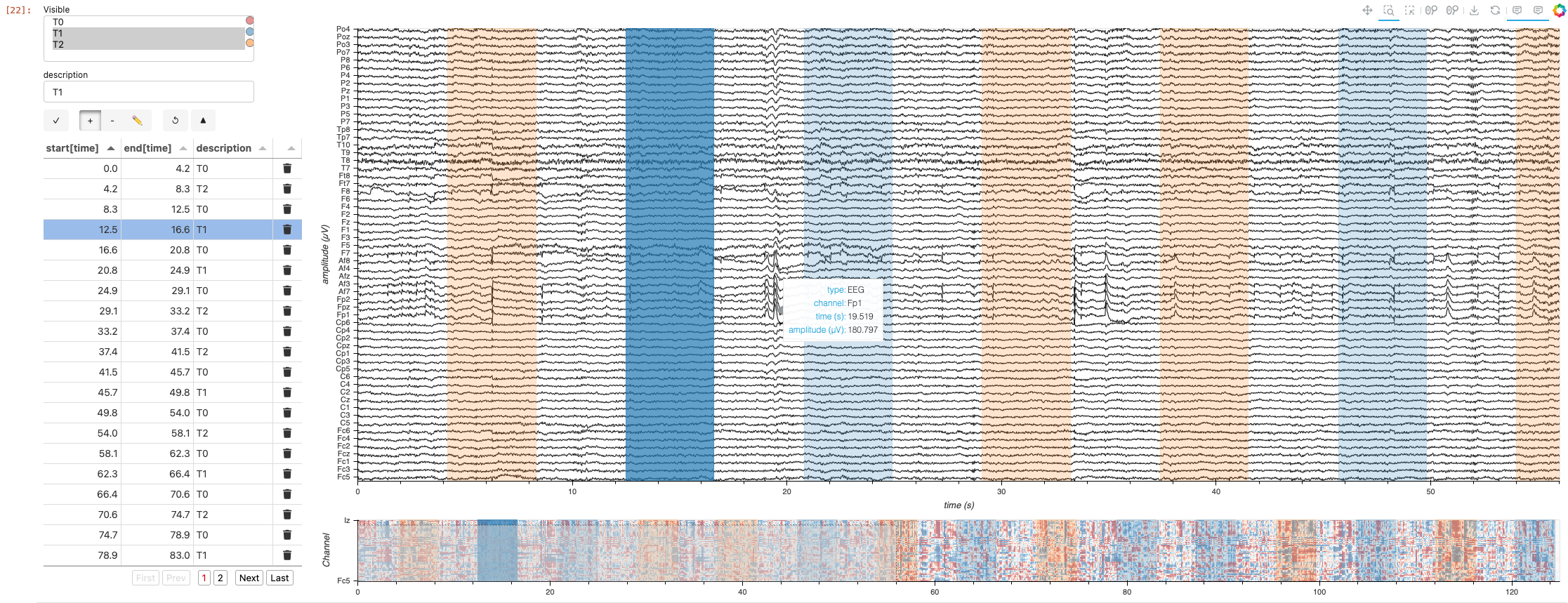
Annotations may be added using the new HoloViz HoloNote package.
# Get initial time of experiment
orig_time = raw.annotations.orig_time

annotations_df = raw.annotations.to_data_frame()

# Ensure the 'onset' column is in UTC timezone
annotations_df['onset'] = annotations_df['onset'].dt.tz_localize('UTC')

# Create 'start' and 'end' columns in seconds
annotations_df['start'] = (annotations_df['onset'] - orig_time).dt.total_seconds()
annotations_df['end'] = annotations_df['start'] + annotations_df['duration']

annotations_df.head()
| onset | duration | description | start | end | |
|---|---|---|---|---|---|
| 0 | 2009-08-12 16:15:00+00:00 | 4.2 | T0 | 0.0 | 4.2 |
| 1 | 2009-08-12 16:15:04.200000+00:00 | 4.1 | T2 | 4.2 | 8.3 |
| 2 | 2009-08-12 16:15:08.300000+00:00 | 4.2 | T0 | 8.3 | 12.5 |
| 3 | 2009-08-12 16:15:12.500000+00:00 | 4.1 | T1 | 12.5 | 16.6 |
| 4 | 2009-08-12 16:15:16.600000+00:00 | 4.2 | T0 | 16.6 | 20.8 |
from holonote.annotate import Annotator
from holonote.app import PanelWidgets, AnnotatorTable
from holonote.annotate.connector import SQLiteDB

annotator = Annotator({'time': float}, fields=["description"],
                      connector=SQLiteDB(filename=':memory:'),
                      groupby = "description"
                     )
annotator.define_annotations(annotations_df, time=("start", "end"))
#TODO: uncommont the tabulator_kwargs next holonote release
# annotator.groupby = "description"
annotator.visible = ["T1"]
annotator_widgets = pn.Column(PanelWidgets(annotator),
                              AnnotatorTable(annotator,
#                                              tabulator_kwargs=dict(
#                                                  pagination='local',
#                                                  page_size=20,
#                                              )
                                            ),
                              width=400)
# TODO: file and fix issue of why pn.Row(annotator_widgets, pn.Column(annotator * nb_app)) doesn't work. bad opts propagation?
annotated_multichants = (annotator * curves_overlay_lttb).opts(responsive=True, min_height=700)
annotated_minimap = (annotator * minimap)
annotated_app = (annotated_multichants + annotated_minimap).cols(1).opts(shared_axes=False)

pn.Row(annotator_widgets, annotated_app)
Standalone App Extension#
HoloViz Panel allows for the deployment of this complex visualization as a standalone, template-styled, interactive web application (outside of a Jupyter Notebook). Read more about Panel here.
We’ll add our plots to the main area of a Panel Template component and the widgets to the sidebar. Finally, we’ll set the entire component to be servable.
standalone_app = pn.template.FastListTemplate(
    sidebar = annotator_widgets,
    title = "HoloViz + Bokeh Multichannel Timeseries with Time-Range Annotator",
    main = annotated_app,
).servable()
To serve the standalone app, first, uncomment the cell above. Then, in same conda environment, you can use panel serve <path-to-this-file> --show on the command line to view this standalone application in a browser window.
Warning
It is not recommended to have both a notebook version of the application and a served of the same application running simultaneously. Prior to serving the standalone application, clear the notebook output, restart the notebook kernel, and saved the unexecuted notebook file.What Next?#
Head back to the Index page to explore other workflows alternatives.