Building custom Panel widgets using ReactiveHTML
No library can cover all the specialized widgets a user may want… but a good one makes it easy for the user to create their own specialized widget that can be used alongside the library!
Panel is one of those cool libraries–you can create interactive web apps and data dashboards straight from Python code, but if you need more than what’s built-in, you can also create your own custom widgets using Panel’s ReactiveHTML class!
The ReactiveHTML class lets you add a dash of HTML to your Python code and, just as the name implies, make that HTML come alive with reactivity! If desired or needed, you can throw in some Jinja2 and/or Javascript into the mix too. In this blog post, we will demo how to use ReactiveHTML for creating: 1. collapsible sections 2. toggle icons
And demonstrate how we can integrate these components into built-in Panel components.
Let’s get to it!
Collapsible Sections
Bootstrapping with ChatGPT
To get started using ReactiveHTML, you need an HTML template. If you’re unfamiliar with HTML, don’t fret; there are tons of examples so ChatGPT can synthesize an example easily!
<!DOCTYPE html>
<html lang="en">

<head>
    <meta charset="UTF-8">
    <meta name="viewport" content="width=device-width, initial-scale=1.0">
    <title>Details Tag Example</title>
</head>

<body>
    <h1>Expandable Content</h1>

    <details>
        <summary>Click to expand</summary>
        <p>This is some hidden content that can be expanded and collapsed.</p>
    </details>

    <p>Other content on the page...</p>
</body>

</html>
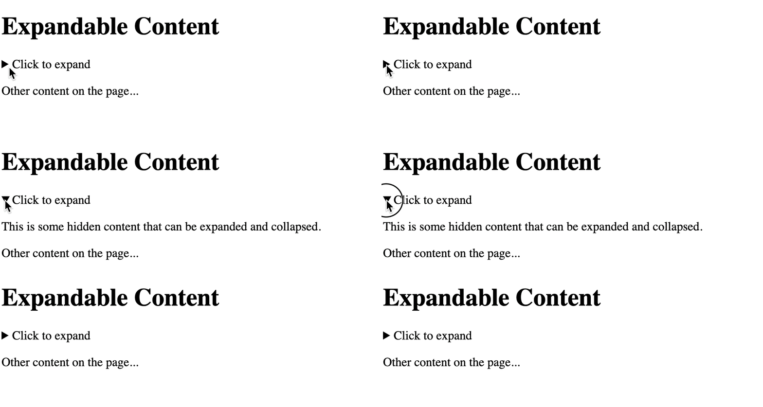
If we save this code to index.html and open it, we get the following:

Since we just want the collapsible section, let’s only extract the details tag and start building our custom ReactiveHTML widget.
import panel as pn
pn.extension()

class CollapsibleSection(pn.reactive.ReactiveHTML):

    _template = """
        <details>
            <summary>Click to expand</summary>
            <p>This is some hidden content that can be expanded and collapsed.</p>
        </details>
    """

CollapsibleSection()
Making the HTML Reactive
Now for the cool part: we can replace the static contents with dynamic contents in 1–2–3: 1. Add a content param of generic Parameter type to the class. 2. Update the <p> element to a <div> element containing an id attribute. 3. Replace the static contents with ${contents} inside the new <div> element.
class CollapsibleSection(pn.reactive.ReactiveHTML):

    contents = param.Parameter()

    _template = """
        <details>
            <summary>Click to expand</summary>
            <div id="contents">${contents}</div>
        </details>
    """

CollapsibleSection(contents="New dynamic contents")
Users can also update the section’s contents dynamically!

And it’s not limited to just strings, but any Panel component! How awesome is that!?

Implementing Additional Parameters
If you’ve been following along, you may have noticed that the section collapses every time contents is updated.
We can prevent this by adding the open attribute to the details element.
class CollapsibleSection(pn.reactive.ReactiveHTML):

    contents = param.Parameter()

    _template = """
        <details open=true>
            <summary>Click to expand</summary>
            <div id="contents">${contents}</div>
        </details>
    """
It doesn’t have to be static either–making it dynamic is as easy as before! 1. Add an opened param of Boolean type to the class. 2. Update details element to include an id attribute. 3. Replace true with ${opened}.
class CollapsibleSection(pn.reactive.ReactiveHTML):

    contents = param.Parameter()
    opened = param.Boolean()

    _template = """
        <details id="opened" open=${opened}>
            <summary>Click to expand</summary>
            <div id="contents">${contents}</div>
        </details>
    """
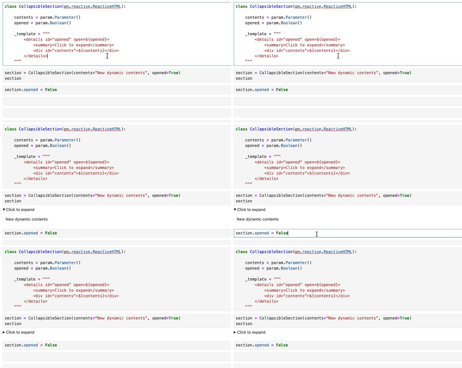
Now opened can be controlled dynamically as well!

Now, as an exercise, try making the summary element reactive too!
ToggleIcons
Displaying an Icon
Making collapsible sections only required HTML. To build upon that, let’s demonstrate how to trigger Python functions inside the HTML template!
Here’s some code to start out:
iconis watched and used to initialize_svg, which is requested from tabler-icons. The_svgis then used in the HTML template.
import requests
class ToggleIcon(pn.reactive.ReactiveHTML):

    icon = param.String(default="thumb-up")

    _svg = param.String()

    _template = """
        <div id="icon">${_svg}</div>
    """

    @pn.depends("icon", watch=True, on_init=True)
    def _update_icon(self):
        response = requests.get(
            f"https://tabler-icons.io/static/tabler-icons/icons/"
            f"{self.icon}.svg"
        )
        svg = response.text
        self._svg = svg
Toggling Active
But… it doesn’t live up to its name of “ToggleIcon” though, so let’s fix it!
The first step is adding an active parameter of Boolean type and making _update_icon depend on it, appending -filled if active.
class ToggleIcon(pn.reactive.ReactiveHTML):

    icon = param.String(default="thumb-up")

    active = param.Boolean(default=False)

    _svg = param.String()

    _template = """
        <div id="icon">${_svg}</div>
    """

    @pn.depends("icon", "active", watch=True, on_init=True)
    def _update_icon(self):
        filled = "-filled" if self.active else ""
        response = requests.get(
            f"https://tabler-icons.io/static/tabler-icons/icons/"
            f"{self.icon}{filled}.svg"
        )
        svg = response.text
        self._svg = svg
The next step is adding the ability to click on the icon to toggle it!
To do so, create a method that toggles active upon click, named _click_icon and use that as the onclick attribute in the div element.
class ToggleIcon(pn.reactive.ReactiveHTML):

  icon = param.String(default="thumb-up")

  active = param.Boolean(default=False)

  _svg = param.String()

  _template = """
      <div id="icon" onclick=${_click_icon}>${_svg}</div>
  """

  def _click_icon(self, event):
      self.active = not self.active


  @pn.depends("icon", "active", watch=True, on_init=True)
  def _update_icon(self):
      filled = "-filled" if self.active else ""
      response = requests.get(
          f"https://tabler-icons.io/static/tabler-icons/icons/"
          f"{self.icon}{filled}.svg"
      )
      svg = response.text
      self._svg = svg
Polishing the Design
It’s great that the icon is clickable, but how does the user know? 🤷
Fortunately, there’s an easy solution: add cursor: pointer as an inline style (or stylesheet). Now you can see a little hand when you hover over the icon.
class ToggleIcon(pn.reactive.ReactiveHTML):
    icon = param.String(default="thumb-up")

    active = param.Boolean(default=False)

    _svg = param.String()

    _template = """
        <div id="icon" onclick=${_click_icon} style="cursor: pointer;">${_svg}</div>
    """

    def _click_icon(self, event):
        self.active = not self.active


    @pn.depends("icon", "active", watch=True, on_init=True)
    def _update_icon(self):
        filled = "-filled" if self.active else ""
        response = requests.get(
            f"https://tabler-icons.io/static/tabler-icons/icons/"
            f"{self.icon}{filled}.svg"
        )
        svg = response.text
        self._svg = svg
Another thing to note is every time the icon is clicked, it has to request the icon; to speed things up, we can add caching!
class ToggleIcon(pn.reactive.ReactiveHTML):
    icon = param.String(default="thumb-up")

    active = param.Boolean(default=False)

    _svg = param.String()

    _template = """
        <div id="icon" onclick=${_click_icon} style="cursor: pointer;">${_svg}</div>
    """

    def _click_icon(self, event):
        self.active = not self.active

    @pn.cache
    def _fetch_svg(self, icon, active):
        filled = "-filled" if active else ""
        response = requests.get(
            f"https://tabler-icons.io/static/tabler-icons/icons/"
            f"{icon}{filled}.svg"
        )
        svg = response.text
        return svg

    @pn.depends("icon", "active", watch=True, on_init=True)
    def _update_icon(self):
        self._svg = self._fetch_svg(self.icon, self.active)

ToggleIcon(active=True)
Great, clicking repeatedly now feels much more responsive than before!
Finally, before we wrap things up, we can implement custom size…
import param
import panel as pn
import requests
pn.extension()

class ToggleIcon(pn.reactive.ReactiveHTML):
    icon = param.String(default="thumb-up")

    active = param.Boolean(default=False)

    _svg = param.String()

    _template = """
        <div id="icon" onclick=${_click_icon} style="cursor: pointer;">${_svg}</div>
    """

    def _click_icon(self, event):
        self.active = not self.active

    @pn.cache
    def _fetch_svg(self, icon, active):
        filled = "-filled" if active else ""
        response = requests.get(
            f"https://tabler-icons.io/static/tabler-icons/icons/" f"{icon}{filled}.svg"
        )
        svg = response.text
        return svg

    @pn.depends("icon", "active", watch=True, on_init=True)
    def _update_icon(self):
        svg = self._fetch_svg(self.icon, self.active)
        if self.width:
            svg = svg.replace('width="24"', f'width="{self.width}"')
        if self.height:
            svg = svg.replace('height="24"', f'height="{self.height}"')
        self._svg = svg
For a big thumbs up!

Using the Components Together
Widgets, alone, aren’t as useful as if they’re together.
Here, both the components are used:
- The collapsible section holds a yellow background.
- The icon is now a light bulb.
- The icon’s
activeparameter is linked to the collapsible section’sopenedparameter, so that when it’s clicked, it opens the section to see a bright yellow light!
import param
import requests
import panel as pn
pn.extension()

class ToggleIcon(pn.reactive.ReactiveHTML):
    icon = param.String(default="thumb-up")
    active = param.Boolean(default=False)

    _svg = param.String()

    _template = """
        <div id="icon" onclick=${_click_icon} style="cursor: pointer;">${_svg}</div>
    """

    def _click_icon(self, event):
        self.active = not self.active

    @pn.cache
    def _fetch_svg(self, icon, active):
        filled = "-filled" if active else ""
        response = requests.get(
            f"https://tabler-icons.io/static/tabler-icons/icons/{icon}{filled}.svg"
        )
        svg = response.text
        return svg

    @pn.depends("icon", "active", watch=True, on_init=True)
    def _update_icon(self):
        svg = self._fetch_svg(self.icon, self.active)
        if self.width:
            svg = svg.replace('width="24"', f'width="{self.width}"')
        if self.height:
            svg = svg.replace('height="24"', f'height="{self.height}"')
        self._svg = svg

class CollapsibleSection(pn.reactive.ReactiveHTML):
    contents = param.Parameter()
    opened = param.Boolean(default=True)

    _template = """
        <details id="details" open=${opened}>
            <summary>Click to expand</summary>
            <div id="contents">${contents}</div>
        </details>
    """

icon = ToggleIcon(icon="bulb", active=False)
background = pn.pane.HTML(width=50, height=50, styles={"background": "yellow"})
section = CollapsibleSection(contents=background, opened=False)
icon.link(section, active="opened")
pn.Row(icon, section).servable()
Conclusion
In this blog post, we explored the process of building custom widgets for Panel using ReactiveHTML. By leveraging HTML and Python, you can create personalized and interactive components that seamlessly integrate with your Panel dashboards. This approach enhances the interactivity and user experience of your data visualization projects, making them more engaging and informative. Panel’s support for custom widgets through ReactiveHTML opens up a world of possibilities for creating unique and dynamic web applications. Whether you’re developing data dashboards, interactive reports, or any other type of web-based data visualization, custom widgets can help you tailor your applications to your specific needs.
Reference
https://panel.holoviz.org/explanation/components/components_custom.html#reactivehtml-components
[https://panel.holoviz.org/how_to/custom_components/custom_reactiveHTML.html])https://panel.holoviz.org/how_to/custom_components/custom_reactiveHTML.html)