HoloViz Examples Gallery Modernization
HoloViz: Simplifying Data Visualization
HoloViz is a collection of open-source tools designed to make Python data visualization easier and more powerful. It includes tools like Panel, hvPlot, HoloViews, and Datashader. Most tools have their own gallery, such as the Panel App Gallery or the HoloViews Gallery, which focus on their specific features and APIs.
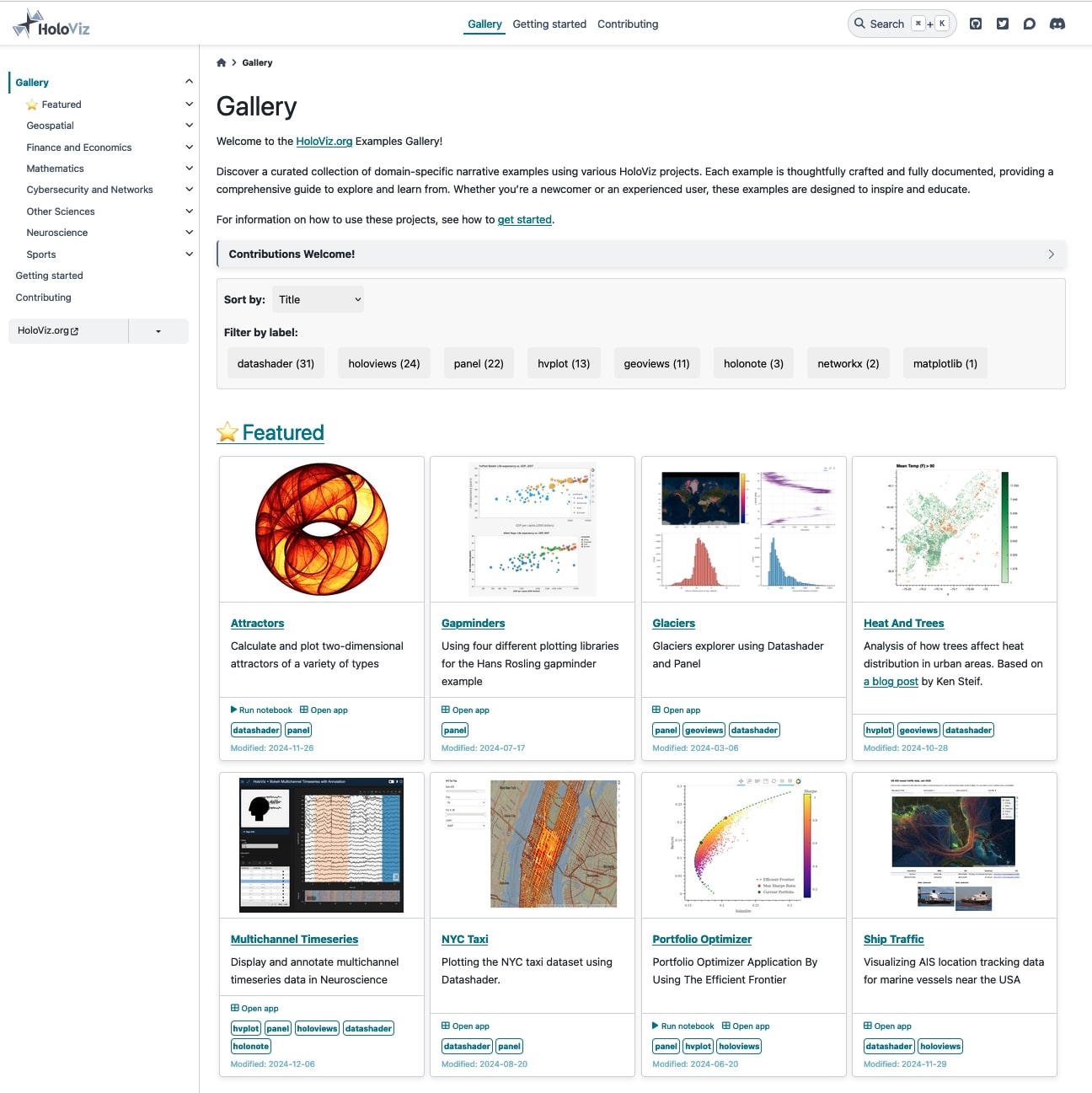
The HoloViz Examples Gallery is different. It showcases more than 40 real-world examples that combine multiple HoloViz tools into domain-specific workflows (geospatial, finance, neuroscience, mathematics, cybersecurity, etc.). These examples go beyond demonstrating individual tools—they tell data stories. This makes it easier to understand how to use the tools together and apply them to practical problems.
The Examples Gallery isn’t just a learning resource. It’s also a great way for users to contribute to HoloViz. By bringing their domain expertise, contributors can add new examples that reflect unique use cases and ideas. Updated examples, better contributor guides, and a clear process for adding content make it easier than ever to join the HoloViz community.
Thanks to a NumFocus small development grant, we’ve made significant improvements to the Examples Gallery, and we’re excited to share the details in this blog post.
What Makes the Examples Gallery Special?
- Run Anywhere: Each example is available as an
anaconda-project1 zip file, so you can run it with the correct dependencies and datasets on any platform. Learn how here. - Interactive Options: Most examples include a read-only notebook (try one) or an interactive Panel app (try one). These let you explore interactively, even when full interactivity isn’t possible on the static site. Thanks to Anaconda for hosting these!
Maintaining a large and complex collection of examples is a big challenge for an open-source team. Over time, the gallery became outdated, relying on tools and APIs that no longer reflected best practices. Updating the infrastructure was straightforward, but refreshing the content took much more work. That’s why we applied for a NumFocus Small Development Grant in late 2022, to modernize the gallery and bring in new contributors.
With the $10,000 grant awarded in early 2023, two new contributors, Isaiah and Jason, joined the project. Together, they tackled these goals:
- Update high-priority examples to reflect current best practices
- Improve and simplify contributor guidelines
- Organize examples into categories for easier navigation
- Add new examples to highlight underrepresented domains
Using a detailed checklist, Jason and Isaiah—mentored by Demetris and Maxime and supported by critical feedback from other members of the HoloViz team (Jim, Philipp, Simon, and Andrew)—updated and modernized 15 examples. Their work included restructuring examples, enhancing UIs, updating dependencies, and adopting modern APIs. In the rest of this post, we’ll focus on how they improved the APIs.
Modernization: APIs
Plotting API: Prioritize hvPlot over HoloViews
Many examples were created before hvPlot was available or mature enough to use. hvPlot offers a simple, Pandas- and Xarray-friendly interface while exposing many capabilities offered by other HoloViz tools. In many cases, we replaced HoloViews code with hvPlot for its accessibility and ease of use. However, hvPlot isn’t a universal replacement—features like complex interactivity (e.g., linked selections, streams) are still exclusive to HoloViews.
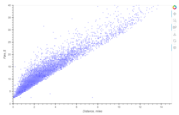
For instance, the NYC Taxi example creates a scatter plot to see the relationship between distance and fare cost. The modernized version uses hvPlot for clarity and simplicity.
Original code:
scatter = hv.Scatter(samples, 'trip_distance', 'fare_amount')
labelled = scatter.redim.label(trip_distance="Distance, miles", fare_amount="Fare, $")
labelled.redim.range(trip_distance=(0, 20), fare_amount=(0, 40)).opts(size=5)
Modernized code:
samples.hvplot.scatter(
    'trip_distance', 'fare_amount', xlabel='Distance, miles',
    ylabel='Fare, $', xlim=(0, 20), ylim=(0, 40), s=5,
)
Large Data Rendering: Prioritize rasterize over datashade for Bokeh Plots
rasterize and datashade are HoloViews operations powered by Datashader, designed to handle large datasets by transforming elements into images where each pixel represents an aggregate of the underlying data. While both are essential for visualizing large data, they differ in functionality and use cases.
datashade: Produces an RGB image that is sent directly to the front-end (browser) and displayed as is. This approach offers fast rendering but limits interactivity, such as hover tooltips or color bars, because the raw data is not available to the plotting library.rasterize: Generates a multidimensional array of aggregated data, which is sent to the front-end for further processing, such as applying colormaps. Although this requires more work from Bokeh, it allows for richer interactivity, including hover information and client-side color bars.
Due to these advantages, rasterize is now the recommended choice for most large dataset visualizations. Ongoing development continues to expand its capabilities and improve its integration across the HoloViz stack when using Bokeh as the plotting backend.
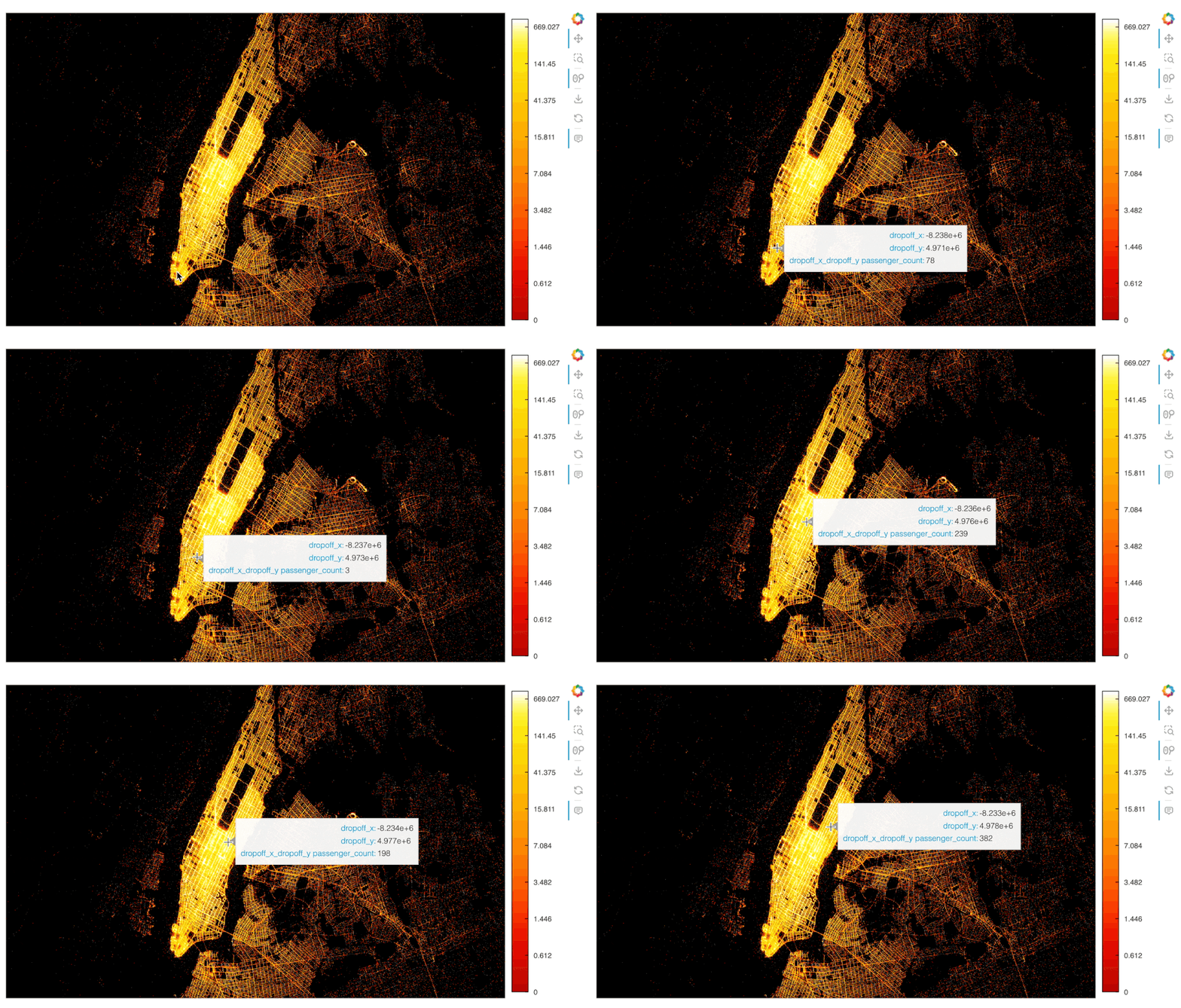
For example, the NYC Taxi example demonstrates how rasterize can render 10 million data points interactively. The plot shows drop-off locations, with passenger counts aggregated per pixel and displayed on hover.
Modernized code:
df.hvplot.points(
    'dropoff_x', 'dropoff_y', rasterize=True, dynspread=True,
    aggregator=ds.sum('passenger_count'), cnorm='eq_hist', cmap=cc.fire[100:],
    xaxis=None, yaxis=None, width=900, height=500, bgcolor='black',
)
Interactivity API: Prioritize pn.bind()
Over the years, Panel has introduced multiple interactive APIs, and choosing the right one can be challenging. As the package has matured and user-feedback incorporated, pn.bind() has become the preferred option for linking widgets to functions while offering flexibility and a cleaner syntax over pn.interact() (deprecated), @pn.depends(), or .param.watch() for most use cases.
Importantly, exceptions remain, such as the recommendation to use @param.depends() to decorate methods for applications built with param.Parameterized classes, or using .param.watch() for more fine-grained control. Additionally, the Portfolio Optimizer example demonstrates the use of the new reactive expression API (.rx), which extends pn.bind() and the deprecated pn.interact() for reactive programming. This experimental .rx API is a promising addition, and we encourage users to explore it and share feedback.
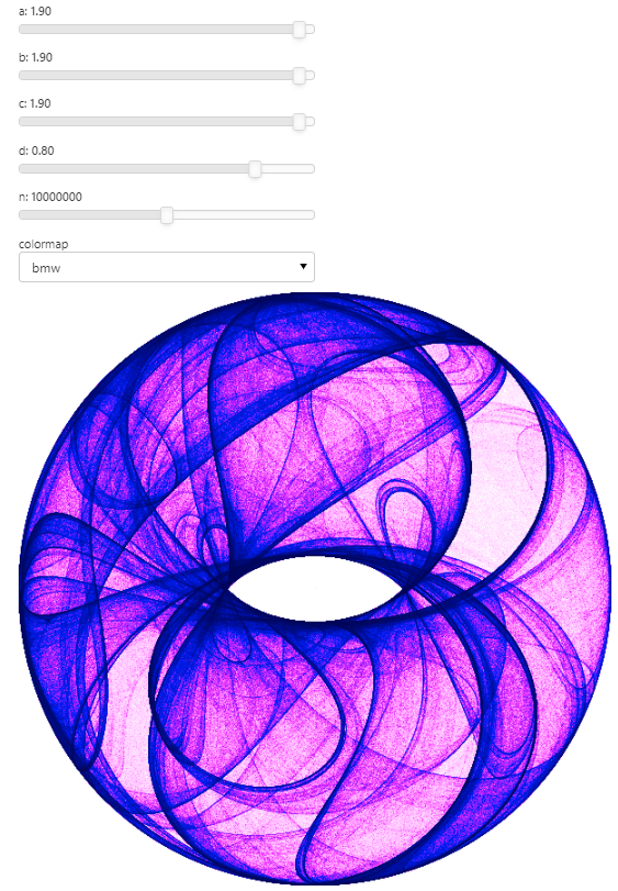
In the Attractors example, we updated the code by replacing the deprecated pn.interact() with pn.bind(). This modernized approach explicitly links widgets to a function that plots an attractor using Datashader.
Original code:
pn.interact(clifford_plot, n=(1,20000000), colormap=ps)Modernized code:
widgets = {
    'a': pn.widgets.FloatSlider(value=1.9, end=2.0, step=0.1, name='a'),
    'b': pn.widgets.FloatSlider(value=1.9, end=2.0, step=0.1, name='b'),
    'c': pn.widgets.FloatSlider(value=1.9, end=2.0, step=0.1, name='c'),
    'd': pn.widgets.FloatSlider(value=0.8, end=1.0, step=0.1, name='d'),
    'n': pn.widgets.IntSlider(value=10000000, start=1000, end=20000000, step=100, name='n'),
    'colormap': pn.widgets.Select(value=ps['bmw'], options=ps, name='colormap'),
}

bound_clifford_plot = pn.bind(clifford_plot, **widgets)
pn.Column(*widgets.values(), bound_clifford_plot)
Improved contributor guide
To support the modernization efforts and encourage new contributions, the contributor guide was updated to reflect the changes in infrastructure. The guide now provides clearer instructions and step-by-step guidance for new users to create and contribute examples to the gallery.
To make the process even more accessible, Isaiah created a detailed video tutorial that walks through each step of contributing a new example.
New Example: FIFA World Cup 2018
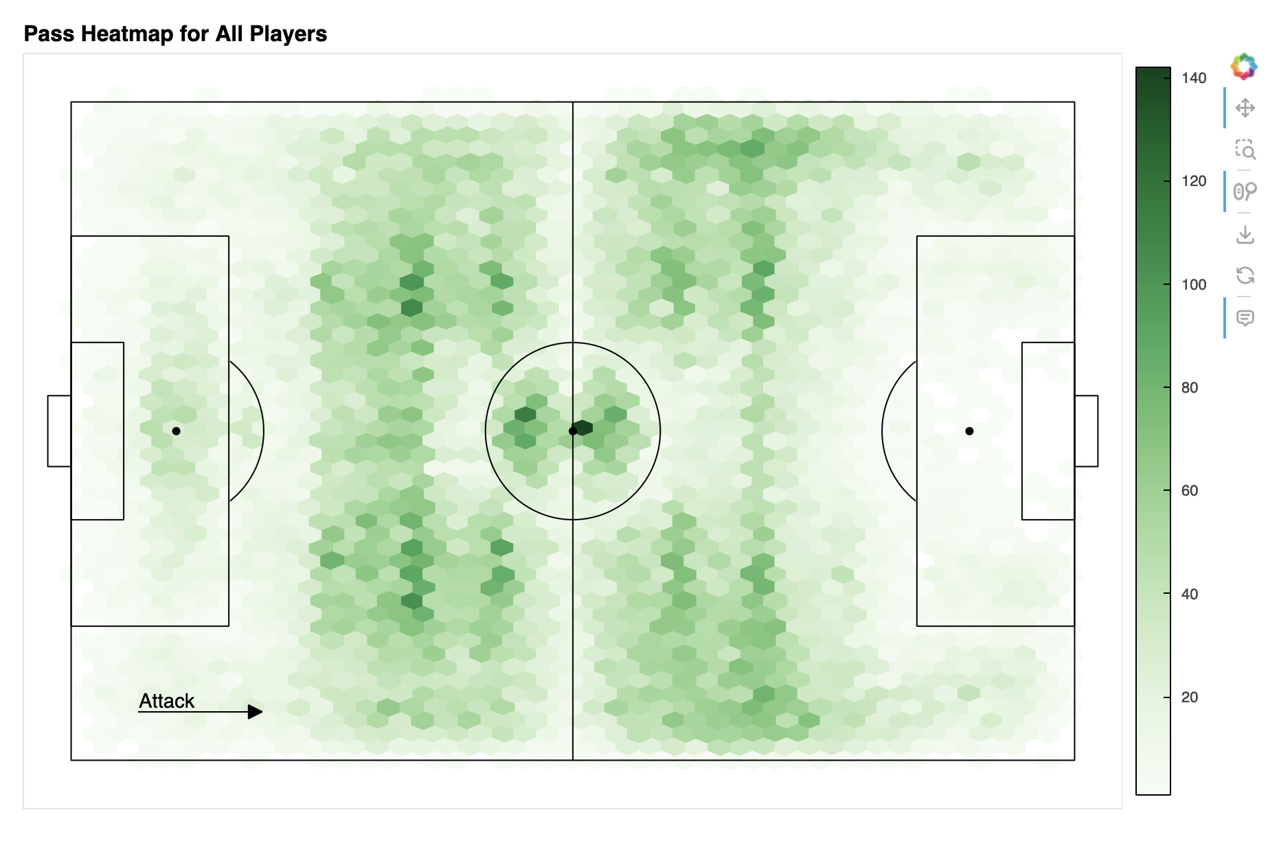
Driven by his passion for football (soccer), Isaiah contributed an exciting example analyzing data from the FIFA World Cup 2018 tournament. This example delves into the performances of iconic players like Kylian Mbappe and Lionel Messi during the event.
You can explore the example in multiple ways:
Reflections
Jason’s Reflections
Contributing to the revitalization of the examples website was an enlightening experience for me. Beyond learning about HoloViz tools, I gained a deeper understanding of open source contributions, including the workflow intricacies. This includes creating pull requests when making new changes or opening a new issue to document bugs found in the examples. Neither of which I’ve used when developing my own projects. Setting up the environment was also a tricky process as I had to do it in WSL. This exposure to WSL has helped me when working with other projects that are required to be using Linux.
Overall, I am thankful to have been given this experience as a contributor as I’ve acquired a fundamental understanding of the tools that could be used.
Isaiah’s Reflections
Working on this project has not only been an enjoyable experience but also an incredibly educational one. The journey began with a steep learning curve, but overcoming those initial challenges has made the entire process more rewarding.
Key Learnings
Panel and HoloViz Libraries
The Panel and HoloViz libraries were at the core of our project. Panel, being a high-level app and dashboarding solution for Python, allowed us to create interactive visualizations effortlessly. HoloViz, with its suite of tools designed to work seamlessly together, made data visualization tasks more intuitive and efficient. These tools have significantly enhanced my ability to create compelling and interactive data visualizations.
Datashader
Modernizing examples using the Datashader library was one of the highlights of the project. Datashader excels at creating meaningful visualizations from large datasets, a critical capability in the age of big data. My extensive use of Datashader has turned it into a reliable tool that I now feel confident using for future projects.
Anaconda-Project
Another crucial aspect of the project was mastering anaconda-project. It facilitated managing project dependencies and environments, ensuring that the project was reproducible at various levels. This experience underscored the importance of reproducibility in data science, which is vital for collaboration and long-term project sustainability.
Overcoming Challenges
The initial phase was riddled with challenges, particularly in setting up the project locally and navigating the submission process for Pull Requests. The support from the project leaders was invaluable. Their guidance helped streamline our workflow, making subsequent tasks more manageable and efficient. This collaborative effort not only improved my technical skills but also reinforced the importance of teamwork and effective communication.
Future Prospects
This project has been a significant milestone in my career. Working with the HoloViz team has not only broadened my technical expertise but also inspired me to continue exploring and utilizing these tools. I am excited to integrate HoloViz and its associated libraries into my future personal and professional data science endeavors.
This project has been an enriching experience, providing both challenges and opportunities for growth. The skills and knowledge gained will undoubtedly influence my future work, and I am grateful for the chance to contribute to such a dynamic and innovative project.
Demetris and Maxime’s reflections
We want to thank Jason and Isaiah for the incredible effort they put into this project. As early-career developers, they took on a complex task—working with HoloViz’s expansive ecosystem—and did a great job making meaningful contributions. It’s not easy to navigate so many tools, APIs, and evolving documentation, but they approached the challenge with curiosity and determination.
Along the way, they helped us identify gaps in our APIs and brought fresh perspectives to our discussions about user experience. Their insights sparked conversations that led to improvements not just in the examples, but across HoloViz tools. We also appreciated their patience and adaptability as we all worked together to smooth out the edges of our first project funded by a NumFocus grant.
This collaboration wasn’t just about the examples—they’ve made lasting contributions to the ecosystem and the community. We’re excited to see where their journeys take them next. Jason and Isaiah, thank you for your hard work!
Footnotes
anaconda-projectis a project management tool created in 2016 and that predates most (if not all!) of the tools of this type like Poetry, Hatch, PDM, Pixi, conda-project, etc. It is no longer maintained and we do not recommend adopting it, some day we’ll migrate to another tool.↩︎
